Solving All CSS Layout Issues — any screen, any root font size, without JS
How to create a webpage that looks perfect on any device, no matter its screen width or the chosen root font size (no JS)
Today we will see how easy it is to create responsive webpages with fluid design. We will study the CSS template that solves the layout issues.
Hire an architect to make the layout of a house. When he asks about the size of the terrain for the house, you answer, “I will not tell you.”.
This is NOT just a “px” vs “rem” article.
Convention
We will be talking all the time about screen widths. But most of the time we will mean the browser inner width.
Foreword
For a long time, I had what I call “the pixel mindset”. Because
- this is our natural mindset. Pixels are constant — they don’t change by the user’s preference, like the browser default font size — and easy to think about, like centimeters.
- using pixel layouts was the pattern in the past, and there are a lot of obsolete blogs and online courses still teaching us. Even some bloggers/designers that suggest other system are not convincing enough.
- I used to test my pixel layouts on my laptop, on my Android, and on my son’s IPhone and said “That’s OK”.
- after all, the browsers work in pixels. Any CSS measure unity that is not pixel is converted to pixel.
- I fear using any new feature, especially when it comes to browsers. And I felt at home with pixel measurement. “new” here is not a precise word.
- I had the strong feeling that using font size as measure unity would be a mess, in case of non monospaced fonts!!!
- I used to leave to the browsers zoom the job of handling people with sight problems.
- I had created a Pixel Art drawing tool that runs in the browser :P
Why have I changed my pixel mindset? Three reasons.
- The feedback I received in my article series, Goodbye HTML. Hello Canvas!, especially about accessibility.
- I am developing a website editor and must consider the current state of the web — all devices that run a browser.
3. The persistent, very helpful and kind advices from Jason Knight .
It is just fluid boxes inside stacked up divisions!
When the first smartphones came into the market, web developers started to wonder how to make webpages for them. Should the current webpage be used or creating a specialized one is the way to go? Note that the first smartphones were not very resourceful.
Some developers believed in creating a lighter version, with less content for smartphones. Often a company had a subdomain only for the mobile version. Two problems with this approach:
- the user of a smartphone “deserved” to be less informed than the user of a computer!
- the developer had to maintain two websites at anytime, synchronizing the changes in their contents.
Nowadays, we don’t talk about that anymore. The same page everywhere is the pattern. And the webpage must adapt itself to the running device screen.
On any screen, the (large) divisions are stacked up. But the boxes inside the divisions may appear side by side or on the top of each other. The layout of the boxes is fluid.
It is just fluid boxes inside stacked up divisions!
The layout in pixels
Before seeing the solution, let’s see the problems of the layout in pixels.
My laptop screen is 1366px wide. The IPhone5 screen is 320px wide; we don’t need to plan for a smaller screen.
Thinking naively, all we have to do is creating 320px wide boxes with zero margin.
They fit perfectly on the IPhone 5 (staked up).
And my laptop can show three of them side by side inside a division, leaving 406 (1366–(3 * 320)) pixels for margins or spacers. Sounds good!
And if the screen is 800px wide? Then we will see 2 boxes side by side (leaving 80 pixels for margins or spacers) and the third box alone below them. Also good!
We can achieve that without JavaScript. Just using CSS media queries for the width/presence of margins or spacers — or using Flexbox (no media query needed).
It is very comfortable to design the content of the boxes because we know that they will be 320px wide everywhere. What a relief ;)
In fact, there are problems with the pixel layout.
Problems of the layout in pixels
How the 320px boxes would fit on a very large screen?
- Small and lost in a huge space? That’s OK because the user knows the screen he has, he may zoom the page or open the page in half window?
- Looking pretty like it looks on a laptop screen?
I am writing this article because the first option is not good enough.
For the second option, we would have to do a lot of adjusts in . Like doubling the widths/paddings/margins of everything, and also doubling each font size.
The characters MUST look bigger.
Besides all the trouble, the chance for introducing bugs in the (heavier) style sheet(s), the chance of not matching all possible screens (current and future), there is a very important question:
What if the root font size was already doubled (or tripled)?
16 pixels is the most common root font size. But devices with (very) large screens have bigger root fonts. Also, users with sight issues use bigger root fonts.
There are three ways for dealing with the unpredictable root font size: the excellent one, the bad one and the terrible one.
- The excellent one: we will see it soon.
- The bad one: you use JavaScript to create a hidden HTML element setting its width to 1rem and ask for his offsetWidth. The result comes in pixels. It is a hack, right? Why don’t browsers just tell the root font size to JavaScript? Anyway, we don’t need to use JavaScript for the responsive layout. Unnecessary complication.
- The terrible one: We force the root font size to be 16px (forgetting people with special needs). I confess that I was using this “practice”. Jason Knight hit me hard because of this.
A layout made with pixels looks ugly on large screens, and easily breaks and/or may hide content when the root font size is not the expected — if a lot of workarounds are not implemented.
I would not say that it is impossible to create the cool webpage, setting the dimensions of layout and fonts in pixels. It is not impossible. It is cumbersome and error-prone.
The solution starts with using “rem” instead of “px”.
The VERY scary voyage to the realm of the REM
At this stage, we agree that a cool webpage must consider (very) large screen sizes and must consider (and respect) the chosen root font size.
“rem” means font size of the root element.
I had the *misconception* that using “rem” would be a mess. How wide is a button set with “rem” if the text inside it is “iiiiii”? And if its text is “WWWWWW”, would it be three times larger? Changing the font family changes the dimension of the button and breaks the layout?
“1rem” means a constant *number of pixels* - that is unpredictable by the developer.
Again: “rem” is just a constant (on each device/browser/session) number of pixels. FORGET about dimensions in characters. Don’t be dumb as I was ;)
Maybe you are thinking, “If ‘1rem’ translates straight to pixels, I could stick with pixels.”. This was exactly my thought in the past. This is the cumbersome and error-prone way. I have something much better for you!
Keep thinking “px” but run “rem”
If you are, like I was, used to set widths in pixels, assuming the root font size is 16px, mark this trick.
Consider you want to set the width of some element to match the IPhone 5 width (320px). It is “20rem” (320px width / 16px root font size). If “20rem” seems weird to you, use this:
<style>
  .my-class {
    width: calc(320rem / 16);
  }
</style>
I mean: you think the number in pixels (for the standard 16px root font size), you write exactly that number (320).
You can use this trick for any dimension, including font size!
Why the IPhone 5 examples?
Because it is still in use (March 2023).
Mainly because its small screen makes an excellent stress test.
Come on… who uses “rem”?
The last drop necessary to my mindset changing (stopping using pixels for layouts) was inspecting a website that is supposed to be created with the best practices. I chose Mozilla Developer Network. If they don’t use “rem”, maybe it is not important.
Here is a screenshot, using the Chrome browser tools:
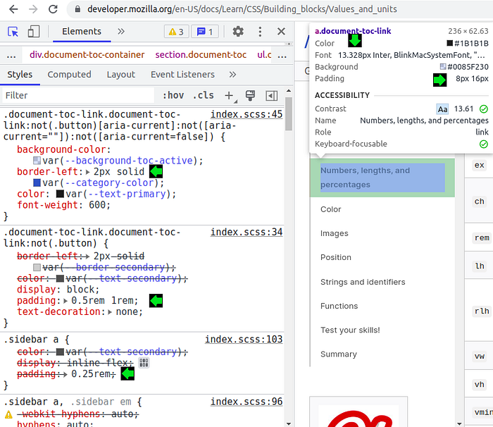
Looking at the floating box in the upper right corner, it is “px” only, because it tells the current/real dimensions.
On the left panel, where “Styles” tell about the CSS declarations, we see the use of “rem” for padding and “px” for border. In other words: “rem” for layout, “px” for a decoration detail, which is not needed/supposed to scale.
Beyond this online inspection, I have downloaded and inspected the style sheets: “rem” rules.
So… it is just to use “rem” instead of “px” for layout?
No, but it is a start, as I told before.
For example, Jason Knight says his media station root font size is 32 pixels. The exact double of the common 16 pixels. If we set everything (widths/paddings/margins and font sizes — even decoration details) in “rem”. Everything will have double size on his device. If his media center screen width is the exact double width of his laptop screen, the only difference between both looks is only the sizes; the layout is identical.
When the screen widths range from 320 to thousands of pixels and the root font size may be four times greater than the standard 16 pixels, just using “rem” instead of “px” may not be enough.
Now we are going to see the solution in details.
The solution
DISCLAIMER
The title of this article says “Solving All CSS layout issues…”. And you probably thought that it was too good to be true. In fact now and here we are accomplishing what the title has promised considering the basic layout that (almost?) all websites use today. Which must be simple because it targets all kinds of device. Nonetheless, the techniques that will be presented are excellent for something sophisticated.
In the end of this article, I will talk about how solving more complex layouts.
The CSS template
I’ve been talking too much. Below is the template that was promised. Take a look at it before I start explaining the “hows” and the “whys”.
<style>
    .-division {
        min-height: 2rem;
        display: inline-flex;
        flex-direction: row;
        padding: 20px 0;
        flex-wrap: wrap;
        justify-content: space-around;
        row-gap: 20px;
    }
    .-box {
        min-height: 2rem;
        max-width: min(100%, 50rem);
        align-self: stretch;
        padding: 15px 5px;
        overflow: auto;
        font-size: 1rem;
    }
</style>
<style>
    /* px based */
    @media (min-width: 360px) {
        .-box {
            padding-left: 10px;
            padding-right: 10px;
        }
    }
    @media (min-width: 412px) {
        .-box {
            font-size: 1.0625rem;
        }
    }
    @media (min-width: 480px) {
        .-box {
            font-size: 1.125rem;
        }
    }
    @media (min-width: 560px) {
        .-box {
            font-size: 1.1875rem;
        }
    }
    @media (min-width: 640px) {
        .-box {
            padding: 20px 3%;
        }
    }
    @media (min-width: 640px) {
        .-box {
            font-size: 1.25rem;
        }
    }
</style>
<style>
    /* rem based */
    @media (min-width: 50rem) {
        .-thin2, .-thin3, .-thin4 {
            width: 45%;
        }
    }
    @media (min-width: 75rem) {
        .-thin3 {
            width: 30%;
        }
    }
    @media (min-width: 100rem) {
        .-division {
            padding-top: 30px;
            padding-bottom: 30px;
            row-gap: 30px;
        }
        .-thin4 {
            width: 22.5%;
        }
    }
</style>
IMPORTANT: the template above is supposed to come after another CSS template called “reset”. Although “reset” is small, posting it now would bloat this article a bit. What matters for us in the “reset” is:
<style>
  /* part of the 'reset' template */
  * {
    margin: 0;
    padding: 0;
    box-sizing: border-box;
  }
  div {
    display: inline-block;
    width: 100%;
  }
</style>
Writing CSS — the golden rules
I follow some golden rules when writing CSS. This article explains those golden rules, but it is a bit outdated.
- Never applying CSS to individual elements (#id).
- Never applying CSS to tags, except for the general reset.
- As consequence of ‘1’ and ‘2’, CSS is applied only to classes.
- Never using compound selectors (like “div > p”).
- There are three kinds of CSS classes: molecular, submolecular and atomic.
- Generally, a molecular class contains many declarations. A molecular class must not override another molecular class; complementing is OK.
- Atomic classes exist to override details of the molecular classes. And have universal nomenclature - like “w30pc” always means “width: 30%;”.
- An atomic class must not override another atomic class; complementing is OK.
- Molecular classes must start with a hyphen; atomic classes must not.
- Submolecular classes are intermediary between both. They are like a small molecular class that exists to override a true molecular class.
- A submolecular class must not override another submolecular class; complementing is OK.
Never forget: CSS classes that override others must be written AFTER the others!
In our template, “-division” and “-box” are molecular classes. “-thin2”, “-thin3” and “-thin4” are submolecular classes.
“-thin2”, “-thin3” and “-thin4” mean the preferred number of thin boxes per row.
Divisions and boxes
Let’s understand the architecture of this system. We have the <body> tag that contains divisions. A division is *not any* <div> tag. It can be a <div>, <header> or <footer>, but must have width 100%.
Inside a division, only boxes (sections) can be directly attached. A division can contain one or more boxes.
Thin box, fat box
A thin box is the default kind of box. It is meant to fit well on any screen, with any number of siblings.
A fat box is a box that is wider (probably twofold) than the thin box.
For example, on a laptop we would see, side by side,
- three thin boxes or
- one thin box and one fat box.
The fat box is not implemented yet.
The samples
The following samples match some basic layouts. There is no need for pictures of samples on smartphones, because the boxes are always stacked up.
Note: “-navy” and “-dash-grey” that are written in the snippets of the samples are not about the layout. They appear just to give you the idea of the real code.
Single box division
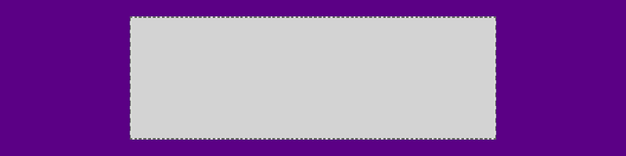
<div class="-division -navy">
    <div class="-box -dash-grey"></div>
</div>
The section “The width of the single box” has useful content about this layout.
Two box division

<div class="-division -navy">
    <div class="-box -dash-grey -thin2"></div>
    <div class="-box -dash-grey -thin2"></div>
</div>
Three box division — A

<div class="-division -navy">
    <div class="-box -dash-grey -thin2"></div>
    <div class="-box -dash-grey -thin2"></div>
    <div class="-box -dash-grey -thin2"></div>
</div>
Three box division — B
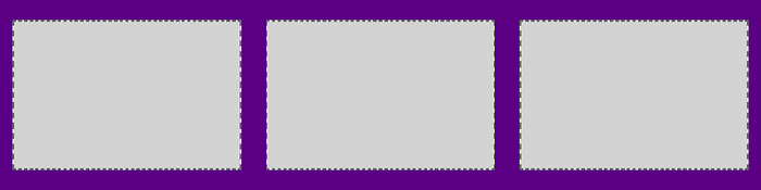
<div class="-division -navy">
    <div class="-box -dash-grey -thin3"></div>
    <div class="-box -dash-grey -thin3"></div>
    <div class="-box -dash-grey -thin3"></div>
</div>
Three thin boxes side by side require a 75rem wide screen or larger, or else 2 boxes per row will be the target.
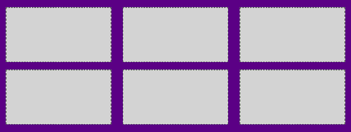
Four box division — A

<div class="-division -navy">
    <div class="-box -dash-grey -thin2"></div>
    <div class="-box -dash-grey -thin2"></div>
    <div class="-box -dash-grey -thin2"></div>
    <div class="-box -dash-grey -thin2"></div>
</div>
Four box division — B
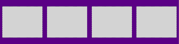
<div class="-division -navy">
    <div class="-box -dash-grey -thin4"></div>
    <div class="-box -dash-grey -thin4"></div>
    <div class="-box -dash-grey -thin4"></div>
    <div class="-box -dash-grey -thin4"></div>
</div>
Four thin boxes side by side require a 100rem wide screen or larger, or else 2 boxes per row will be the target — never 3 boxes on the first row and one box on the second row.
Five box division — A

<div class="-division -navy">
    <div class="-box -dash-grey -thin2"></div>
    <div class="-box -dash-grey -thin2"></div>
    <div class="-box -dash-grey -thin2"></div>
    <div class="-box -dash-grey -thin2"></div>
    <div class="-box -dash-grey -thin2"></div>
</div>
Five box division — B
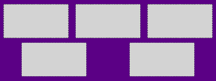
<div class="-division -navy">
    <div class="-box -dash-grey -thin3"></div>
    <div class="-box -dash-grey -thin3"></div>
    <div class="-box -dash-grey -thin3"></div>
    <div class="-box -dash-grey -thin3"></div>
    <div class="-box -dash-grey -thin3"></div>
</div>
Six box division — A
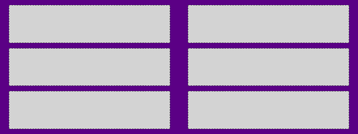
<div class="-division -navy">
    <div class="-box -dash-grey -thin2"></div>
    <div class="-box -dash-grey -thin2"></div>
    <div class="-box -dash-grey -thin2"></div>
    <div class="-box -dash-grey -thin2"></div>
    <div class="-box -dash-grey -thin2"></div>
    <div class="-box -dash-grey -thin2"></div>
</div>
Six box division — B
<div class="-division -navy">
    <div class="-box -dash-grey -thin3"></div>
    <div class="-box -dash-grey -thin3"></div>
    <div class="-box -dash-grey -thin3"></div>
    <div class="-box -dash-grey -thin3"></div>
    <div class="-box -dash-grey -thin3"></div>
    <div class="-box -dash-grey -thin3"></div>
</div>
Seven (or more) box division
Well… you got the idea. The important is that in the same division, all boxes have the same “-thin*” class.
Acknowledging the device screen
The template uses two kind of media queries:
- “px” based media query and
- “rem” based media query.
A “20rem” media query matches the IPhone 5 with 16px root font size, as matches a 1280px wide screen laptop with a 64px root font size. For knowing about the device screen, I must query using “px”.
Many webpages set the ordinary text font size of 16px for a 320px wide screen. And grows pixel by pixel up to 20px font size — for a 640px wide screen, for example.
I mean, they start with 1rem and grows up to 1.25rem.
@media (min-width: 640px) {
    .-box {
        font-size: 1.25rem;
    }
}
The code above is just a part of the pixel based media queries of the template.
The width of the single box
The thin (standard) box maximum width is 100%, or else the user would need to horizontally scroll the webpage.
Considering the laptop screen, 1366px is too much for 16px font text lines. A good line is made of 10 or 12 words in average. 800px is a good width.
We must set two rules for the maximum width: no more than 100% and no more than 800px. As we decided to go the “rem” way, we say “50rem”. Therefore, we don’t need to care about that 32px font size media center, remember?
max-width: min(100%, 50rem);In case we want a box to fill the whole division, we use this width declaration for the <p> tag inside the box. And set the box width to 100%.
No to margins - Yes to paddings and row gaps
Since there are no margins in this template, how the space among the boxes of a division is set?
We combine the Flexbox model with media queries.
Spaces among rows
.-division {
    min-height: 2rem;
    display: inline-flex;
    flex-direction: row;
    padding: 20px 0;
    flex-wrap: wrap;
    justify-content: space-around;
    row-gap: 20px;
}
Note that
- the division uses the Flexbox model
- the left and right padding are zero
- the top padding is 20px
- the bottom padding is 20px
- the row gap is 20px
This is how the layout handles the space among rows. The 20px value is increased for bigger screens:
@media (min-width: 100rem) {
    .-division {
        padding-top: 30px;
        padding-bottom: 30px;
        row-gap: 30px;
    }
}
Why not setting the paddings (margins) in “rem”? Because a person with sight problems, using a big root font size would have a lot of the screen taken by (blank) padding.
Imagine a smartphone with 48px as root font size and the paddings becoming three times bigger…
Spaces among columns
The space among columns is set with “rem” based media queries in combination with this CSS declaration of the division: justify-content: space-around;
@media (min-width: 50rem) {
    /* 2 thin boxes per row */
    .-thin2, .-thin3, .-thin4 {
        width: 45%;
    }
}
@media (min-width: 75rem) {
    /* 3 thin boxes per row */
    .-thin3 {
        width: 30%;
    }
}
@media (min-width: 100rem) {
    /* 4 thin boxes per row */
    .-thin4 {
        width: 22.5%;
    }
}
The snippet above queries for the available width (the width of the division) in order to set the best width for the boxes, always leaving around 10% of the total width for blank space.
Small screen, big font size
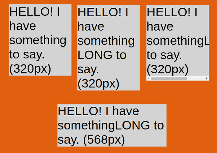
In the picture above we have four samples of a box on an IPhone 5 (320 x 568 pixels screen) with root font size set to 64 pixels!
Probably this is not a real world case, but I like to test the edge cases.
In the first three samples, the device is in portrait mode. In the last it is in landscape mode.
In the first sample we have a text with normal words and it is OK.
For the other three samples, the word “something” is replaced by “somethingLONG”.
“word-break: break-word;” was used in the second sample.
“overflow: auto;” was used in the third sample.
Nothing special was done for the fourth sample. And it is OK.
Always test your layout against a big root font size.
Having all boxes of the row with the same height
This template automatically sets all boxes of the same row to the same height, as long as you don’t manually set the height of one or more boxes.
It is OK to set the minimum height of one or more boxes.
And how about the content inside the boxes?
This is a subject for another article, because the present article is already very big. But this is easy, too.
What I can tell you now is that the font size *inside* each box is not “rem” based: it is “em” based. This means a proportion of the font size of the box (that was set considering the root font size and the available width).
So far, so good…
Before finishing the article, let’s make a very small review.
You are a guy/girl/whatever that wants to write very cool, rock solid webpages, is ready to embrace the “rem” and sleep like a king/queen/royal-whatever because you know that your layout constructed taking the browser font size as dimension unity cannot be broken, right?
Wrong!
Sorry.
Web developers are cursed from the day one. Do you still remember how much of your life was wasted in that distant day, trying to figure out where you did wrong because the button with background color “Dark Grey” looked lighter than the button with background color “Grey”?
That was a “subtle” message from the Web Gods: “Run away from this madness while you can…”.
I was almost shipping the article when I found this:
Breaking the sacrosanct “rem” based layout
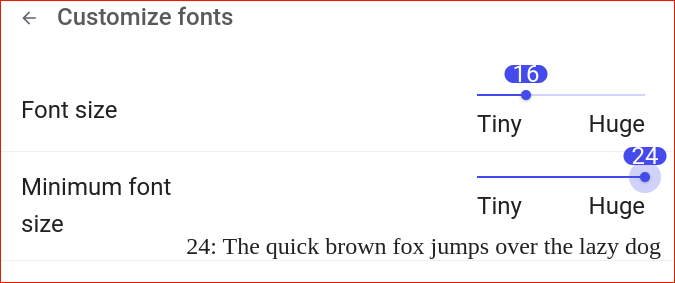
I feel my eyes tired, and I decide to increase the size of the fonts of the browser. I open the “settings” panel and find two sliders. I raise the value for the one that says “Minimum font size” to 24px. The result pleases me and I close the panel.
Chrome allows setting the minimum font size up to 24px. Firefox allows setting it up to 72px!
Note that the minimum font size (24px) is now bigger than the (default/root) font size (16px). It is silly, but there is no problem, right?
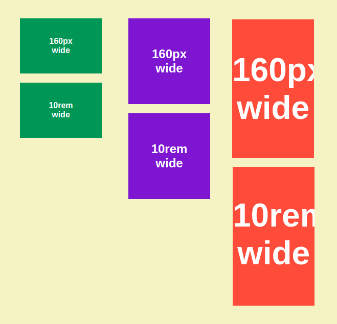
I created a webpage with two <divs>, the width of the first is 160px, and the width of the second is 10rem. And set the body font size to 1rem.
The picture above shows three samples of this webpage (except that the colors were changed for better understanding) on different browser settings.
In all three cases, the browser (default/root) font size is the standard 16px. Only the *minimum font size* of the browser changes.
THE GREEN SAMPLE
The minimum font size is set to 12px, smaller than the default font size.
The computed font size is 16px, as expected.
The sizes of the <divs> are the same, as expected,
(10rem * 16px/1rem == 160px).
THE BLUE SAMPLE
The minimum font size is set to 24px, bigger than the default font size.
The computed font size is 24px, as expected (because of the new minimum font size).
The upper <div>, the one which width was set in pixels, keeps its 160px width, as expected.
But the lower <div>, the one which width was set to 10rem, still is 160px wide, when it should be 240px wide!!!
THE RED SAMPLE
Here we have the same broken layout that happened with the blue sample. The difference is that the sample was run in Firefox, and the minimum font size of the browser was set to 64px.
Setting the minimum font size of the browser to a greater value than the value of its default font size, breaks a “rem” based layout because the text grows while everything else don’t — even media queries ignore that the default font size became obsolete.
If the minimum font size (24px) is bigger than the default font size (16px), the browser should automatically override the default font size (to 24px); because NO text in the webpage will have the default font size (16px).
Remember when I mentioned (and advised against using) a JavaScript hack to get the root font size. I bet that hack would not be fooled by the browser minimum font size issue ;P — if we use a Monospace character inside the hidden HTML element.
The root font size and more browser nonsense
<style>
  /* DON'T use this! Respect people with sight issues */
  :root {
    font-size: 20px;
  }
</style>
You should never use the snippet above. If someone sets the default font size of his browser to 32px, for example, he had a reason.
But we want to make an experiment, just checking if it is possible to override the browser settings.
Yes, it is possible to override the (default/root) browser font size, as long as the chosen value is equal or greater than the value for the browser minimum font size.
But there is a catch: although the text will obey to our forced root font size, media queries will completely ignore it and stick with the browser original default font size!
Hire an architect to make the layout of a house. When he asks about the size of the terrain for the house, you answer, “I will not tell you.”.
Developing for the web as you wish
I am developing a free online webpage editor that aims to be the best alternative for building static webpages:
- the fastest and easiest development (point and click interface, built-in components)
- the fastest and most lightweight (single file) webpages in pure HTML/CSS
It is called Web As You Wish, under construction at the moment.
EDIT:
But you can play with its *teaser*like in the video below:
What I mean is, when the editor becomes ready, you will not need even to use the template presented today. Web As You Wish will do that for you!
If using JavaScript is necessary to handle the browser minimum font size issue, Web As You Wish will do that for you too!
Stay tuned
Link for the next article!
Level Up Coding
Thanks for being a part of our community! Before you go:
- 👏 Clap for the story and follow the author 👉
- 📰 View more content in the Level Up Coding publication
- 💰 Free coding interview course ⇒ View Course
- 🔔 Follow us: Twitter | LinkedIn | Newsletter
🚀👉 Join the Level Up talent collective and find an amazing job

